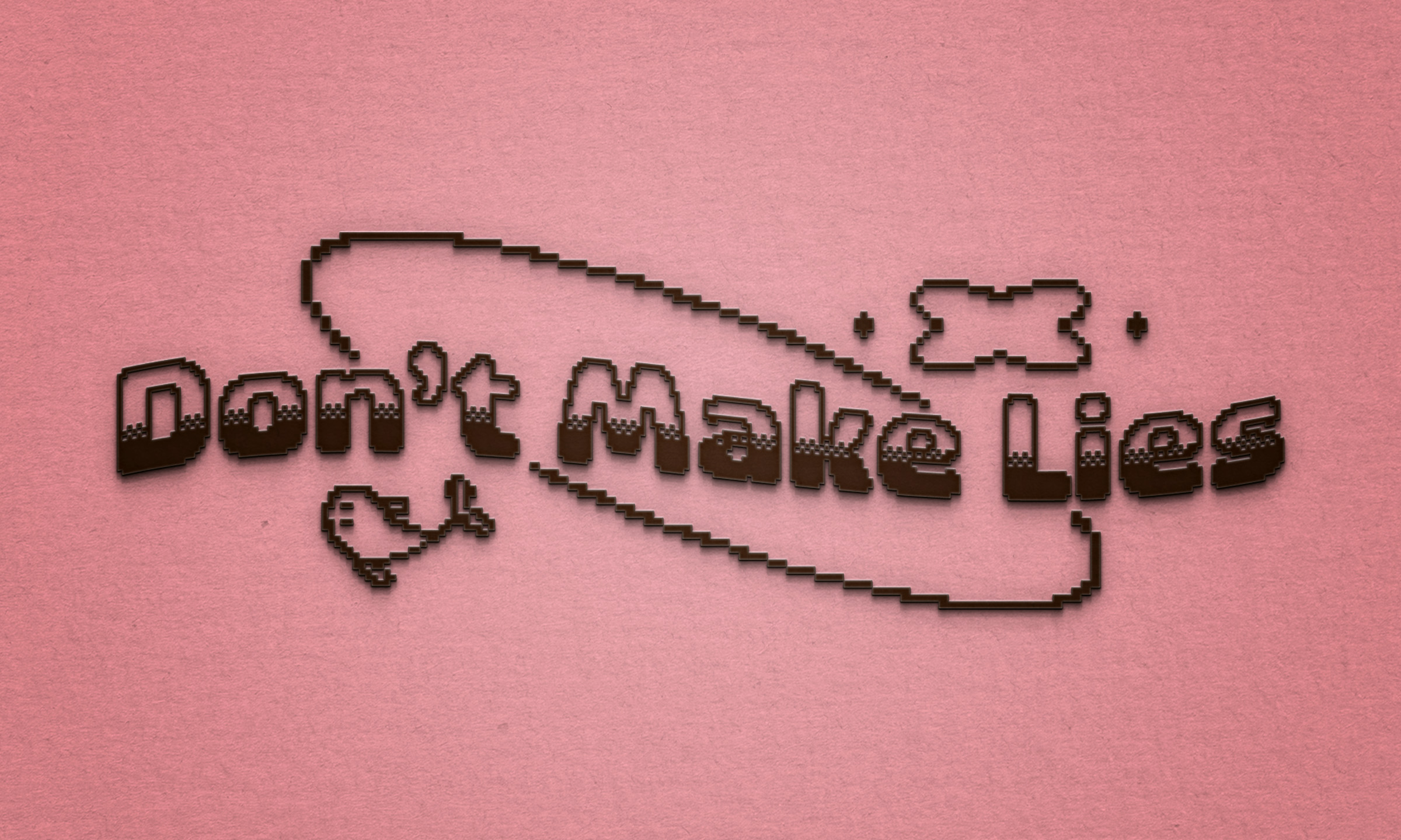
Moving away from the similar styles of the previous look, the new branding has a more playful and younger tone with a pixelated logo and typeface choice.
Logo, color palette, typeface choice, and other design elements for my personal brand.
I'll usually refresh the logo every two years, and the latest update was January 2024.
See the Instagram carousel here.
Moving away from the similar styles of the previous look, the new branding has a more playful and younger tone with a pixelated logo and typeface choice.

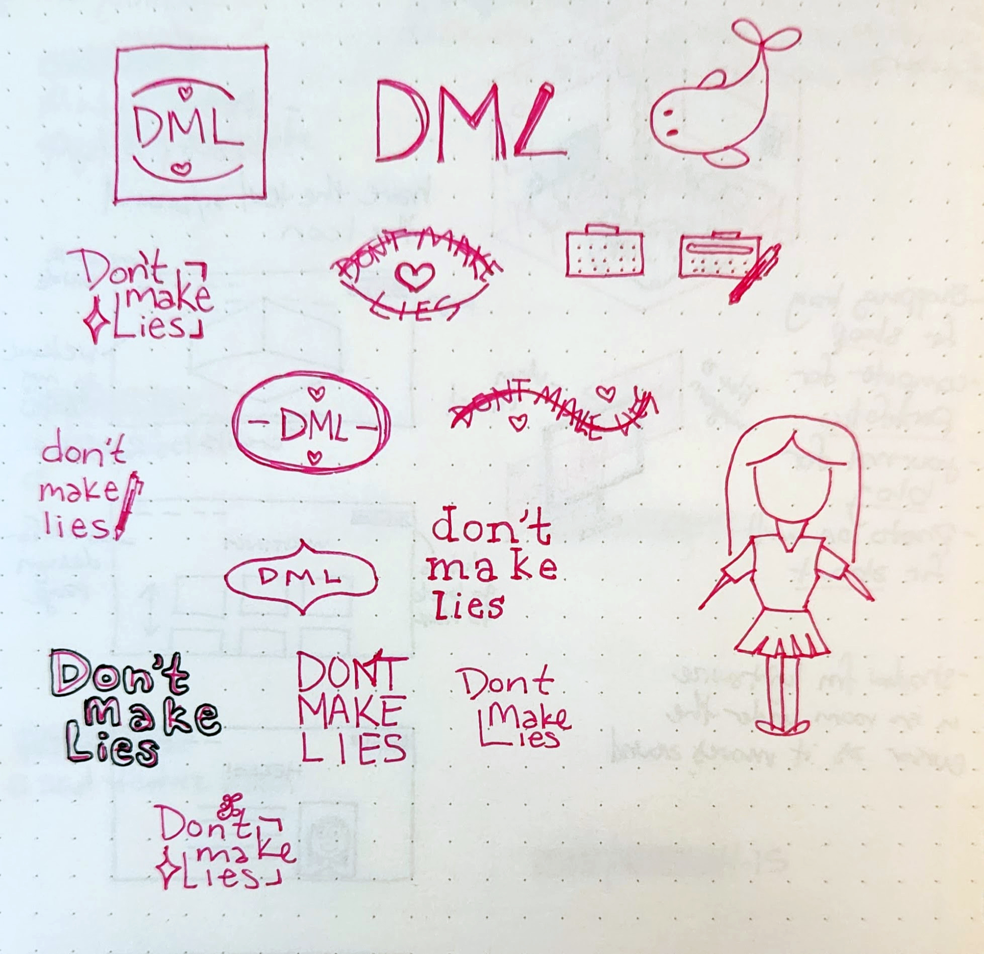
Here were some preliminary ideas for the logo.

I chose a brighter color palette than the last, keeping a shade of pink as the primary color to keep in line with the previous look. It's a fun and feminine color that represents my approach.

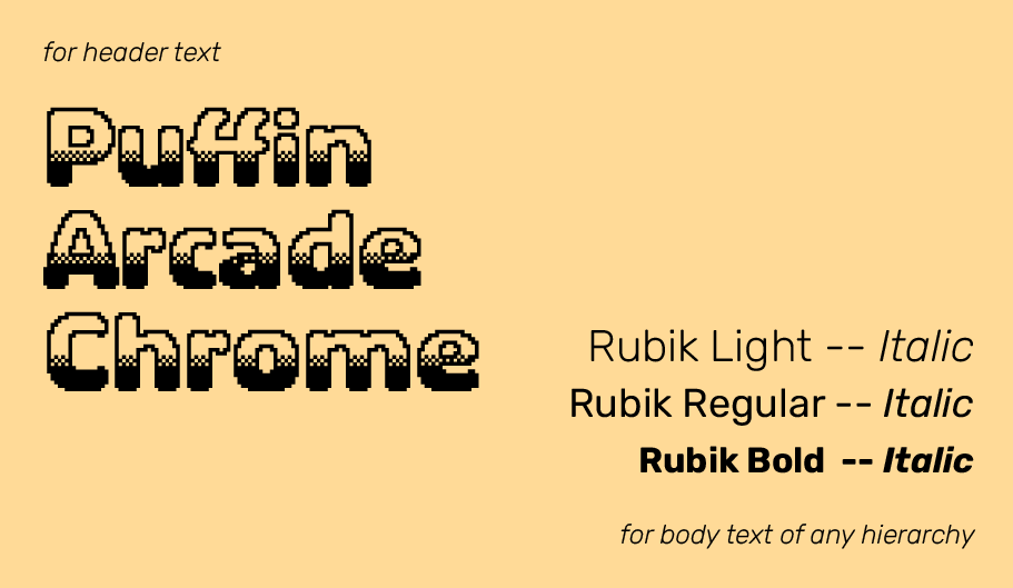
The typefaces Puffin Chrome and Rubik are the primary ones used. They're licensed from Adobe Fonts and Google Fonts, respectively. They can be seen throughout this website as headers and primary text.
